Filming Schedule
Below is a filming Schedule that Tom made before we started filming
Filming Session One
Date: Tuesday 12th October
Time: 13:00 to 15:00
Location: Suffolk Lodge- Garden, Driveway, Living Room
Actors: Sophie (Singer) Tom (Me) (Boyfriend)
Props: Only those that form the Mise-en-Scene of the garden and house
Costume: Normal Costume and Corset Costume
Equipment: Camera, Tri-Pod, Charger
Shots to be filmed: Location Shots, Arguement Sequence, Bench Sequence, Cage Sequence
Filming Session Two
Date: Tuesday 19th October
Time: 13:00 to 16:00
Location: Streets around Suffolk Lodge
Actors: Sophie (Singer)
Props: None Needed
Costume: Corset Costume
Equipment: Camera, Tri-Pod, Charger
Shots to be filmed: Wall Sequence, Handheld Sequence, Walking/ Running Sequence
Filming Session Three
Date: Tues 26th October *UPDATE* Re-scheduled (After Half Term) Tues 9th November
Time: 15:30 to 17:00
Location: Drama Room
Actors: Sophie (Singer)
Props: Mannequin and Microphone
Costume: Prom Dress, Short Lacy Dress, Flower Dress
Equipment: Camera,Tri-Pod, Charger, Block, Studio Lights, Media Filming Lights, Black Sheet
Shots to be filmed: Variety of Angles and Shot types with Mannequin and Costumes
*UPDATE* on 15th November
Filming Session Four
Date: Tuesday 16th November and Wednesday 17th November
Time: 13:00 to 16:00 and 10:00 to 12:15
Location: Suffolk Lodge- Bedroom and Garden and Streets around Suffolk Lodge
Actors: Sophie (Singer)
Props: Photo Album, Mobile Phone, Corset, Heels, Make-up and Bedroom Mise-en-Scene
Costume: Normal Costume and Corset Costume
Equipment: Camera,Tri-Pod, Charger
Shots to be filmed: Transformation Sequence, Re-Filming and Instrumental Sequence
Monday, 27 September 2010
Monday 27th September - Anna Neale Inspiration
Anna Neale Website Inspiration


Above (left) is the original Anna Neale website http://www.annaneale.net/. This site inspired me when I discovered it and therefore I decided to try and use sections that I liked in the website and made various mock ups, using Microsoft PowerPoint. I experimented with different effects, texts and colours to create a similar effect. I used her photos, because I was seeing what effects I could achieve, also the photos of Sophie will be taken at a later date. The design in the centre is my favourite, due to its quiet, calm background, compared to the one on the right. Also the effects used on the photo would grab my eye more. The only weak part of the middle design is its versatile nature, in terms of the image we were inspired by, by her song "Not made for this". In which there are two sides to the character, a vulnerable, naive one and angry, frustrated one. So for future development I would try and incorporate both personas. This task was an independent task which I did whilst others in my group were researching other websites. This task was purely for me to use a piece of software and see it potential for our website design in terms of text, image and effects.


Above (left) is the original Anna Neale website http://www.annaneale.net/. This site inspired me when I discovered it and therefore I decided to try and use sections that I liked in the website and made various mock ups, using Microsoft PowerPoint. I experimented with different effects, texts and colours to create a similar effect. I used her photos, because I was seeing what effects I could achieve, also the photos of Sophie will be taken at a later date. The design in the centre is my favourite, due to its quiet, calm background, compared to the one on the right. Also the effects used on the photo would grab my eye more. The only weak part of the middle design is its versatile nature, in terms of the image we were inspired by, by her song "Not made for this". In which there are two sides to the character, a vulnerable, naive one and angry, frustrated one. So for future development I would try and incorporate both personas. This task was an independent task which I did whilst others in my group were researching other websites. This task was purely for me to use a piece of software and see it potential for our website design in terms of text, image and effects.
Friday, 24 September 2010
Friday 24th September - Website Analysis
Website Analysis - Florence + the Machine
 (1)
(1)  (2)
(2)  (3)
(3)
 (4)
(4) (5)
(5)
 (1) (2)
  (3)
(3) (4)
(4) (5)
(5)Above are screen shots from "Florence + the Machine" official website. I like this website because its quite different, and it suits their overal image and motif, as a band. The first overall look of the page (1), keeps the same theme as the album cover, singles/EP's covers and the narratives of all her songs (on her first album), which were mostly about the inside of the human body. This theme is most definitely shown by the pair of lungs, which the navigation bars on (2). This is a really original touch to the site and in our design I would love to include maybe a mannequin with certain links on it, so it would link to our song. This site instantly plays you a selection of Florence + the Machine songs, which insults one of your senses (5), therefore you are hooked in to looking around the site, causing you to stumble across merchandise and concert tickets. Good advertising tool! Also on this page there is a video link, which is currently playing one of their music videos. This is also a good promotion tool, in case the viewers haven't seen the video or heard the song. Also there is a "whats new" section (3), this is currently promoting her new edition album, with "cosmic cover". This advert instantly grabs your eyes, along with the songs, and it is very easy to get hooked. This website is very unique, original and fits their image of indie, alternative, rock perfectly.
Website URL: http://florenceandthemachine.net/
Thursday, 23 September 2010
Thursday 23rd September- CD Cover Analysis
CD Cover Analysis - Ellie Goulding (Indie Pop)
.jpg)

+Thanx+to+originalglazed.png)
.jpg)

+Thanx+to+originalglazed.png)
1) Above is the EP cover for Ellie Goulding's "Run In To The Light" remix album. The album consists of a mid shot of Goulding, with her hair blowing behind her and suggest that she is "running". This is a potential link to the title of the album "Run into the light". She is wearing a dark coloured top with a wide neck. This fairly loose, free clothing was probably chosen so that it would also slightly blow in the breeze. This image is in black and white, which portrays her skin colour to be very pure and it is not obvious that there could be some foundation or other forms of make up on her face. Goulding is almost shutting her eyes in this shot, therefore suggesting she could be entering a dream like state, or the "light" could represent either death/heaven or peace. The text is almost "shinning" and compliments the black and white image perfectly. The size and font, as you can see in the other three albums, is the same, this recurring graphological motif obviously informs fans that this is the same artist and to expect the same genre and theme in her songs.
2) Above is the EP cover for Ellie Goulding's "Guns and Horses" single EP/Album. This image consists of a long shot of Goulding, who is wearing black leggings, a black top and black cardigan with silver dots on. She seems to be rising from the background of the image, with the "sparkles" and "stars" which enhance her outline. Her head is aimed towards the right side of the image, with one side of her blonde hair shown through the hood of Goulding's cardigan. The background colour is a dark brown, this makes the "yellow/orange" sparks stand out and enhances their importance on the cover. The text "Ellie Goulding" and "Guns and Horses" is located just below centre of the image, and again using the same font and size to enhance the artist motif.
3) Above is the EP/Album cover for Ellie Goulding's "The Writer" single track. The colour scheme on this album is slightly different to the other two, but the music video for this song isn't Goulding's usual theme as well, however as shown above the same text and size has been kept, therefore again increasing Goulding's motif. On this album, a long shot has been taken of Goulding, kneeling on the light coloured grass, with a white dress on. The blonde hair compliments the dress perfectly and suits the slow, powerful song. The sparks and stars around the text and the edges of the album, again are evident like in (1) and (2), this is also a recurring motif, making sure audience members know who the artist is.
These three albums above, all by the same artist, show individuality, and instantly portray Goulding's indie pop, unique image. This proves that Goulding has a set theme that is carried through all mediums e.g CD, sound, website etc.
I think these examples are fairly easily done, because they don't involve heavy editing, so if we were going to do something similar I think we could achieve this. In these examples, Goulding is situated as the main object, therefore, due to her being the "star", grabs the audience's attention. Especially in "The Writer" EP, where she looks quite vulnerable and naive, which could portray certain sexual connotations, and with the low cut dress and skin exposure, could create a sense of deliberate voyeurism. Having the artist as the main object in the picture is a good marketing strategy (which we plan to use in our CD cover), and the recurring motif definitely attracts fans who become familiar with the aesthetics of Goulding's merchandise.
Thursday 23rd September - CD Cover Analysis
CD Cover Analysis - Madonna
Tracking changes through time with same Artist and different themes and influences....
Here some examples of Madonna's CD cover artwork from 1983 - 2008
Here some examples of Madonna's CD cover artwork from 1983 - 2008
(1- Madonna (1983), 2- True Blue (1986), 3- Like a Prayer (1989), 4- Eroticia (1992), 5- Bedtime Stories (1994), 6 - Music (2000), 7 - American Life (2003), 8 - Confessions on a Dancefloor (2008), 9 - Celebration (2009) )
 (1)
(1) (2)
(2)  (3)
(3)
 (4)
(4)  (5)
(5) (6)
(6)
 (1)
(1) (2)
(2)  (3)
(3) (4)
(4)  (5)
(5) (6)
(6)  (7)
(7) (8)
(8) (9)
(9)
These CD images above demonstrate Madonna's changing images throughout her career as a music artist. Image 1 portrays Madonna as a vulnerable artist, and seeing as this was her first album cover in 1983, this would have made sense. However, this quite plain black and white artwork represents her as quite a unique artist, and also symbolises a sense of vougerism. Seeing as she has direct eye contact with the audience, this imediately draws them in to her image and "original image". The text is written vertically, twice. This unusual approach, is unconventional to viewers eyes, therefore they have to spend more time accessing the artwork, therefore hopefully becoming more interested. The title of her first album, "Madonna", is fairly simple and I hope, when we design our CD cover we thing of an original title which is appropriate to the song and our artist's own image.
In image 2 Madonna, due to her being more confident, has shut her eyes, as if in some kinda of fantasy. This technique takes the audience in to her "pretend world" and makes them more interested to find out what she is thinking. This ambiguity makes the audience feel as if they should buy the album, just to find out why this pose is being taken, and hopefully the songs will provide answers. Similary to image 1, Madonna's costume, hair and make up are very suited to the time period, early to mid eighties. This approachable mise and scene helps the audience relate to her, therefore increasing the artist/audience bond. In our CD cover, I hope to engage the audience's interest through the eye contact or eye direction rather than having the eyes completely shut.
In Madonna's 3rd and 4th album, they create a certain sense of voguresism, definetley through the shot of Madonna's wasit in image 3 and throught the album name of "Eroticia" in image 4. This convention in artwork, is a very clever way of attracting the opposite sex. Madonna has chosen to use a shot of her open mouthed in her "Eroticia" album artwork, this creates a strong sense of sexual references, and could engage certain audience members, maybe through shock, or maybe though excitement. Image 3 creates almost a "cowboy" sense, due to her hand position around the belt, similar to image 6. This close up on Madonna's waist is also promoting a sexual reference, however this time, it is less blunt. Therefore again attracting attention from a wide range audience.
The "Bedtime Stories" album also promotes a sexual innuendo, and could be slightly mis-leading. This album, again attracts various viewers, however this time the wide open eyes enhance the relationship and create an obvious relationship between her and her fans. The make up heavily enhances her eyes and lips, which make them stand out, therefore again suggesting a underlying message of sex. The title of this album, could also be confused as a children's album, due to the title "Bedtime stories". In our compact disc cover I hope to use the star to convey an image for the song, using maybe slightly ambiguity but still making the image and message of the star clear.
The "Music" album cover and the "American Life" album cover show two contrasting images that Madonna has tried to create. Album 6 consists of her first ever mid shot, which shows the whole upper body, with open eyes, and again the "cowboy" kind of effect, with the hat, shirt and the text logo. Her next album, is again a mid shot, however this image is very dark, shocking but effective. The heavy blacks and reds, make the album stand out and portray the image of historical America. This album, compared to her other ones is quite shocking, therefore hopefully attracting fans and other wider members of the public to look at it, buy it, and appreciate her music.
Her five year break, made her come back in 2008 with "Confessions on a Dancefloor". This album artwork is extrememly different to "American Life" and shows Madonna, again not facing the audience but posing in a flexible dance position. This again, creates a promiscuous image, and therefore attracts a male audience. However also, stereotypically dancing, is a female interest, therefore this image will also appeal to a wider female audience. The colour scheme in this album, is initially female orientated with the pinks, purples and silver, therefore the image has to make big impression on the male population for them to be interested. This modern cover, creates a relateable image, therefore again, increasing the audience/ artist connection and relationship. In our CD cover I would like for it to appeal to a male and female audience and not be heavily one sided.
Madonna is a perfect example of changing styles and images to appear fresh and original in the ever changing music industry. This technique helps her discover new themes and ideas, therefore increasing her fans and population interest. I hope that our cover has a continuous image throughout the music video and the website, therefore audience members can understand.
Monday, 20 September 2010
Monday 20th September - Treatment
Treatment
Our group consisting of Andrew Tinley, Sophie Neil, Thomas Adcock and Josh Curran chose the track, “Not Made for This” by Anna Neale.
We chose this track due to its familiar pop structure and rock influence. We also appreciated the emotional context and relatable narrative of a typical troubled teenage girl, within a relationship. We opted for a pop themed song because of their accessibility, creating a style that can be easily translated in to a music video. We chose a female artist as within the pop genre females are more prominent and are what an audience expect from a pop song and its associated music video.
We intend our main narrative to be a teenage girl, Anna- played by Sophie Neil, who is unhappy with her relationship because her boyfriend treats her badly. As with many existing female pop videos she will feature in different outfits and situations, in our music video this will show the character to have two distinct personalities, one that is the ordinary girl who is upset and scared to act against her boyfriend and the other who is a confident alter ego who is released by her anger to solve her problems and exact revenge. We will portray this with an array of different scenes. Among others these will include:
• Establishing shot to show the conflict between Anna and her boyfriend.
• Close ups of Anna looking scared and upset
• Anna moulding a mannequin to show how she wishes she could shape the perfect boyfriend. (this shot would also establish a dark theme)
• Anna destroying her room with references to her boyfriend.
• Split screen- with both versions of Anna on either side mirroring each other but in their own distinct styles
• A bird’s eye view of Anna lying partly on a mannequin moving into different positions whilst singing.
• Split screen- one side with Anna being hit/ shouted at by her boyfriend and the other where Anna hits/ shouts at her boyfriend.
• A blank room where words from the song are written on the walls.
These will be exhibited in a non-linear order in short parts to create an authentic music video style in which the shots are kept short and have quick transitions between them.
Sunday, 19 September 2010
Sunday 19th September - Storyboard Planning
Storyboard Planning


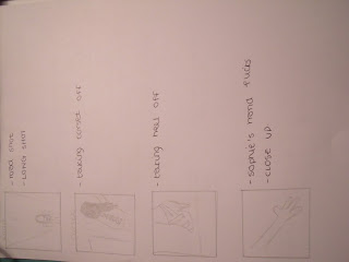
Above are the storyboard plans which me and Sophie completed. I wrote the descriptions and Sophie drew the shots. We feel as if this could potentially be altered in the final edit because of time, production or aesthetic changes.


Above are the storyboard plans which me and Sophie completed. I wrote the descriptions and Sophie drew the shots. We feel as if this could potentially be altered in the final edit because of time, production or aesthetic changes.
Saturday, 18 September 2010
Saturday 18th September - Questionnaire Analysis
Questionnaire Analysis
As our research task, all four of us asked 10 people each to complete our specifically designed questionnaire so we could then make final decisions on certain ideas, shot types, designs etc for our music video, CD cover and website.
 (1)
(1) (2)
(2) (3)
(3)
As our research task, all four of us asked 10 people each to complete our specifically designed questionnaire so we could then make final decisions on certain ideas, shot types, designs etc for our music video, CD cover and website.
 (1)
(1) (2)
(2) (3)
(3)1) The graph above shows our gender, results in terms of how many females and males where asked this questionnaire. I mentioned when I gave the questionnaire out, designed by us all, that we should all ask 10 people each, 5 females, 5 males, therefore hopefully to decrease bias and inaccuracy with our results. This would also make sure that certain stereotypical gender traits wouldn't get portrayed in our final projects. We also asked 40 people, therefore we would have a fairly large number of people, therefore we could then analysis accurate results. We could have asked more, but due to the time limit on this part of the project we stuck to 10 per group member.
2) This graph shows what age ranges we asked. 40% of our results were taken by 15-17year olds. This was quite bias, due to the fact that we are located in college. Therefore for us to ask a wide range of people 32+, which was 5%, wouldn't have been as easy. Our music video, we had decided from the start would be aimed at a teenage audience, therefore it would have been unproductive to ask more of the other age group categories to answer our questions, because they potentially would have given us different aged answers. We have chosen to aim our projects towards a teenage audience, not only due to the tempo and genre of the track but also the star, who we have cast as 16/17 and rateable narrative. The second largest, 25%, which was 18-20 year old groups, would also be quite relative to our decisions, because most old teenagers can be sometimes interested in lower teenage interests, therefore giving us again accurate results and opinions on the questions below. The reason why we have such a high ranged "32+" category was due to the pre-decided decision, where we decided that our music video would be aimed at a teenage audience, therefore I decided to put the age ranges quite close together, hopefully making our results would be more specific and people over the age of 25 we didn't really need to ask, due to our pre-decided decision.
3) This graph displays results on our "genre" question. This question, was vital in terms of our track, because it would have determined whether or not we could not only use the track we had found, but also use our ideas and planning. Luckily we decided that our track would be under the "pop" genre umbrella at the start of the planning process. This was due to the fact that most chart hits, are specified as "mainstream" music, and the majority of these tracks come under the broad genre of "pop" whether they are sub genred or not. (for example Ellie Goulding is classified as "Indie/Pop"). Our highest genre, as shown above was "pop", then closely followed by "rock" and "indie", which we hope to also incorporate in our star's image. Our song and star's image will follow a Pop/Indie/Rock genre and will hopefully follow their typical genre conventions
 (1)
(1) (2)
(2)  (3)
(3)1) The graph above shows the importance of a narrative in a music video. The results suggest that 80% of the people asked, said that a narrative throughout a music video was very important. This result is very positive for our song, which, when we analysed, we discovered it has a plot behind the lyrics, therefore we can go ahead with our initial idea and make our video more interesting to watch. We plan to make our music video have an underlying narrative.
2) The graph above shows whether people are attracted through the music video instantly through the song, therefore making the song have a vital appeal, in terms of attracting its audience. The graph suggest that 90% of the people asked, said that the song is a very important part of attracting viewers to then watch the music video. We hope that our song, has a catchy beat, therefore people will then want to see its music video.
3) This graph shows the results from opinions on pre-song material. 75% of the people said that they like pre-song material. I think pre- song material gives the audience a sneak peak in to narrative of the story, without the actual lyrics, therefore the story is stripped down just to the acting, therefore the true emotion of the song, isn't hidden by music therefore portrayed clearing, hopefully gaining audience empathy. For example in Beyonce's "If I Were a Boy", the pre-song material is vital to the song, because it retrieves audience's attention right from the start. During this filming, we need to ensure that every spoken word and action is necessary to the music video and avoid trying to make it too dramatic. We plan to film brief section of pre-song material in our music video.
 (1)
(1) (2)
(2) (3)
(3)
1) Following on from the question above, we then asked them, if they said yes, how long would you like the pre-song material to be. From the graph, it suggest that most people suggested 21-30seconds, 35% or 11-20 seconds 32%. The lowest result was 50-60seconds, which I agree on, because if a section of pre-song material is too long, for example Lady GaGa's - Telephone (Feat. Beyonce), audiences' get bored and want to hear the actual song. Due to these results our music video will contain pre-song material which is 11-30seconds.
 (1)
(1) (2)
(2)
 (3)
(3)1) Following on from the question above, we then asked them, if they said yes, how long would you like the pre-song material to be. From the graph, it suggest that most people suggested 21-30seconds, 35% or 11-20 seconds 32%. The lowest result was 50-60seconds, which I agree on, because if a section of pre-song material is too long, for example Lady GaGa's - Telephone (Feat. Beyonce), audiences' get bored and want to hear the actual song. Due to these results our music video will contain pre-song material which is 11-30seconds.
2) The next graph, shows that the majority of the features on the right, are quite important in music videos. The main one which people thought was the most important feature was "the star". This will be taken in to account during our filming shedule, therefore we will make sure that our star, is filmed a lot throughout our music video, using various different shot types and camera angles. "Costumes" (15%), "Different Locations" (15%) and "Narrative" (15%) where the next 3 biggest results, in terms of importance in a music video. These are all things, which attract the audience and make current music videos interesting to watch. Also "range of shots" (13%) is also extremely important to a music video to again gain engagement and interest through the interesting, unusual and original camera angles, shots and movement. "Dance routines" (10%) is also quite important, however this is usually only relevant to a fast, up beat, dance chorus song, like pure pop artists like Katy Perry, Girls Aloud, Cheryl Cole, Madonna, Kylie Minogue etc. Mostly female orientated bands, just due to the nature of the dance medium, however JLS and Take That sometimes include routines in their videos, however this is usually aimed towards female viewers. The lowest option was "special effects" (1%), which I completely agree with. Very rarely are there special effects in music videos, which include special equipment. Our resources on this project are limited in terms of that sense so that result benefited our resources well. Lastly "acting" (4%), this area of a music video has a real effect on how well the music video portrays its moral, message or lyrics and achieves its purpose. If acted well, like in Beyonce's "If I were a Boy", it can increase audience engagement, therefore they understand the narrative, feel involved within the video and have empathy towards the characters, therefore hopefully watching it again.
We will take all these consideration in to account when designing and filming our music video.
3) The graph above shows our results on pace. The pace of a music video is very important, and much match the tempo of the song, unless wanting to create surreal effect. Our results show that the majority of people asked choose the "fast" option, the the rest choose "medium". This suits our track perfectly, because it has different levels of tempo throughout, therefore we can change our time per shot depending on the specific tempo of that section.
 (1)
(1) (2)
(2) (3)
(3)
 (1)
(1) (2)
(2) (3)
(3) 1) This graph shows whether people visit artist's websites regularly or not. This shows that people do visit official websites, however the range from "yes" and "no", 24% is more than I would've expected. We will ensure that our website will have daily updates, therefore fans can visit it daily to see new pictures, videos, links, posts etc.
2) This graph shows features of a website and their importance. The highest scoring option was "photos". We will ensure that we have several images of our star on our website, with different camera angles, different costumes and in different locations, so that the fans aren't looking at the same photos. Production photos could be uploaded, to let fans see extra bonus material and funny photos/ outtakes of music video stills. The next biggest option in our results was "videos", these can be interviews, music videos, behind the scene videos, outtakes, fan videos etc. We will ensure that we upload various videos for our fans to see and seem involved in. Having interviews and outtakes of the star, helps them represent their real self towards their fans, rather than certain characters in music videos and still pictures, which could have different connotations. Also having a "star's blog", (17%) will help the fans see the real star, because on blogs star's are usually truthful and this kind of media format can feel friendly and as if fans are having conversation with their idol. This will hopefully increase the artist/ audience relationship. Our "merchandise" option (11%) is a great way to advertise and promote artists CD's/ tour DVD's/ accessories and personalised clothing therefore increasing the artist's profit. "Forums" (6%) are sometimes very useful on websites, because discussion boards, most of the time, are interesting not only for the fans who find out information but for the artist who can get hints and tips on what the public liked and disliked about their track/album/image.
3) This graph relates to the percentage of the site the public wanted images of the star on. The highest option was "60%" of the site, therefore we will try and adopt this result in to our design when we design our site. Images of the star can not only attract people but inspire fans, therefore helping the star become some teenage idol or better known in the music industry.
 (1)
(1) (2)
(2) (3)
(3)1) This graph is people's opinions on star discussions on the website. The majority of the people asked, said that they would like to be able to have discussions with the star on the site. This will not only, same as forum, be beneficial for the fans but also provide the artist with new information. This also will create a friendly relationship on the site, where fans can meet other fans and speak to them, this could create a friendly, but safe networking site, where teenagers could communicate with the star, therefore again increasing the artist/ audience relationship and connection, therefore increasing their interest.
2) This graph shows what shots are preferred on the front cover of the CD case. This graph suggest that 37% of people asked would prefer to see a mid shot of the star on the front cover. Mid shots reveal more of the artist, however they can sometimes appear quite vulnerable if they show there shoulders. This for our artist, would be perfect, however we need to yet decide which persona we are adopting on the CD cover. We could carefully edit both persona's on the cover, therefore representing the lyrics and music video, but we would need careful editing, to make it look professional. Long shots (23%) would also make the star seem vulnerable due to the fact that she isn't fully focused on because there is more in the picture where as close up (25%), she would be focus of the cover, therefore she would come across as confident. I would like our CD cover to represent the music video, and relate to the narrative in terms of text, image and colour, possibly in black and white.
3) This graph shows people's opinions about continuous artist's image and theme through their mediums. This graph shows that, from the people who were asked, they would prefer it if the image of the star was continued throughout all their merchandise and music videos. We will be hopefully adopting this, therefore making sure, when we design them that the CD cover and website follow the images and themes which are present in the music video.
Thursday, 16 September 2010
Monday 16th September - Questionnaire
Questionnaire:
Music Video:
1) Gender
Male /Female
2) Age
12-14 /15-17 /18-20 /21-31/ 32+
3) What genre of music do you like?
Indie /Rock /Pop /Country /Jazz /Hip Hop, Rap
4) How important is a narrative in a music video?
Very important /Not important
5) When you like a song, are you interested in seeing the music video?
Yes /No
6) If yes, Why?
7) Would you prefer a music video which includes brief pre-song material, if yes, how long?
Yes/ No
0-10seconds/ 10-20seconds /20-30seconds /30-40seconds
/40-60seconds /60seconds +
8) What features of music videos do you enjoy? (circle two)
The star /Dance routines /Special effects/ Costume changes /Different locations /Narrative Acting /range of shots
9) What type of pace would you prefer, on the music video?
Slow /Mid /pace Fast
10) In your opinion does a music video always have to relate to the song?
Yes/ a little bit /No
Website
11) Do you visit music artists’ websites regularly?
Yes /No
12) What do you like to find on the site?
Photos /Videos /Star’s blog /Merchandise /Tour dates /Forums
13) How much of the site would you like images of the artist to appear on?
0% /20% /40% /60% /80% /100%
14) Would you like the opportunity to have discussions with the artist, on the website?
Yes /No
15) Would you like the website to relate to the current album, and follow the stars image?
Yes /No
CD Cover:
16) What kind of shot, if you want, would you prefer on the CD cover?
Extreme close up /Close up /Mid Shot /Long Shot /Establishing Shot
17) Would you like “art” relating to the star’s image, to be used to accompany the artist’s image on the CD cover?
Yes /No
Wednesday, 15 September 2010
Sunday 15th September - Risk Assessment
Risk Assessment:
Key:
High Risk
Medium Risk
Low Risk
Falling over:
We will ensure that appropriate footwear is worn during all photo taking and filming sessions and make sure that the ground we are walking on during a scene/photo is extremely safe before capturing.
Getting Injured By Moving Car:
We will ensure that precautions are put in to place for road safety during footage around roads and we will never film actors crossing busy roads. (If crossing of a road is necessary in one shot, then the cameraman will never rush actor and make sure he/she feels safe crossing the road and that they do it as naturally and safely as possible).
Hypothermia:
During cold weather, we will ensure that all actors have sensible clothing on and if it is necessary to film scenes without appropriate clothing we will complete these scenes with a high level of focus, therefore it is shot efficiency, preventing unnecessary time in the cold weather.
Getting Lost:
During certain "forest" scenes, we will make sure that all actors have phone in their pocket in their pocket if they cannot find way back. However, this will be prevented by filming in groups of three or four at all times, which will limit individual isolation.
Damage to Equipment:
We will make sure, when handling equipment, that we do so gently and slowly, preventing any quick slips, trips or falls with the equipment. We will also share the equipment when walking therefore preventing any one person to carry all of it by themselves, which will hopefully prevent injury or damage to person or equipment.
Strangers/Assault:
We will make sure as a group that we don't annoy or aggravate members of the public during the filming's of our scenes. We will choose fairly isolated areas during the day to avoid this, but if we encounter a person we will take extra safety precautions to avoid awkward questioning or negative vibes.
General Injury:
We will ensure that our locations are near college during, college hours, so if something happened we can quickly return to get help (or if not near college, then near industrial area or busy town centre). Also we will always travel in a group of 4, therefore if someone is in trouble, one (or two) member(s) of the group can stay with them whilst the other one or two can run off for help.
Illness:
If a member of a group falls ill time needs to be used efficiently to remain on schedule. If its more than 2hrs we need to find replacement or a definite reschedule date will be set and be met without exception.
Motorbike:
In our music video we plan to include a scene/section with a motorbike. These scenes need to be carefully directed and Sophie needs to feel comfortable and safe when getting on and off the bike.
Mannequin Weight:
This year, we plan to include a mannequin in some of our scenes. Due to its weight, we will be extra careful that we never leave it upright, due to its balance. Therefore in all of the scenes it will be placed on the floor when not in use.
Tuesday, 14 September 2010
Tuesday 14th September - Director Research
Director Research


"Nava has been nominated for notable awards, among them a MOBO Awards for Best Video, an MTV Video Music Award for Best Director, as well as a BET award.[4] Nava also won a MVPA honor for his 2003 music video for Beyoncé's "Crazy in Love" in the category of Best R&B Video".
"He has received several mentions for his music videos. For example, the music magazine Rolling Stone named his music video for Britney Spears' "My Prerogative", the Best Music Video from 2004".
Videography (examples - a few...)
Jake Nava


Jake Nava (above) is an English feature film, advertising and music video director, he grew up in Hackney, London before moving to the United States. He is a very diverse director and has been involved in certain music videos in several ways, sometimes directing the narrative of the production and sometimes artistic director for camera. He has worked with artists such as Beyonce, Britney Spears, Shakira, Usher, Pink, Robbie Williams, James Blunt, The Rolling Stones, Dido, Kylie and many more.
"Nava has been nominated for notable awards, among them a MOBO Awards for Best Video, an MTV Video Music Award for Best Director, as well as a BET award.[4] Nava also won a MVPA honor for his 2003 music video for Beyoncé's "Crazy in Love" in the category of Best R&B Video".
"He has received several mentions for his music videos. For example, the music magazine Rolling Stone named his music video for Britney Spears' "My Prerogative", the Best Music Video from 2004".
Videography (examples - a few...)
- Holler - Spice Girls (2000)
- Shiver - Natalia Imbruglia (2005)
- Nobody Knows - Pink (2006)
- Beautiful Liar - Beyonce (Feat. Shakira) (2007)
- Run - Leona Lewis (2008)
- If I Were a Boy - Beyonce (2008)
- Cry Me Out - Pixie Lott (2009)
Monday, 13 September 2010
Monday 13th September - Planning (Camera Shot Ideas)
Extended Planning:


Today we carried on with our plan for our music video project, and analysed various messages and morals which the lyrics could portray. We worked together as a group again today all around a table discussing more general ideas, narrative ideas and camera angles and shot type ideas. We made three mind maps, titled "First Ideas (general)", "Narrative" and "Camera shot ideas". I wrote down what everyone mentioned (no matter how optimistic!), so that later on in the process we can narrow down certain ideas, and hopefully incorporate everyone ideas, giving equal input to each member. This will hopefully cause all members of the group to work effectively as a team and enjoy this project.
Camera Shot Ideas: (initial ideas - subject to change)
We had the idea of a zoom/ establishing shot to begin the music video, which would hopefully would have a scene of dialogue at the start to introduce the audience to the narrative and perhaps make it more clear what this track is about.
We wanted to be quite creative and hopefully try out using the "green/blue screen". We had ideas about putting the lead singer in front of the screen and having a grey/white background for the "singing" shots (with microphone and microphone stand), which we would film her singing the whole song, then later on in the planning/editing process, edit sections which we feel singing is crucial. This also gives us a back up if one of our "scene" and "narrative" ideas/ camera shots fails, therefore we can fill the time with the "singing sections". We agreed we would avoid using long takes because one, this is boring for audience and very unconventional for a music video (Pete Fraser). I mentioned the fact that we need various and several shot types and angles for same shot, so that we can vary and play about with the shots in the editing process so that straight cuts are regular, therefore following a typical convention of music videos (Pete Fraser). This would hopefully also engage audiences' attention. We also discussed ideas about using the screen more creatively, by having paint, blood or ink dripping behind her in certain parts of the song as she gets more "aggressive" or "angry" within the song. We also had a very optimistic idea of having fire behind her if we could edit that well enough for it to look realistic, almost engulfing her. This would represent her frustration and anger towards her boyfriend/partner or issue she has to deal with. Also we had an idea about her hitting the screen with the microphone stand, this would have to be tested because firstly we don't want to break the screen and secondly it could "ripple" the screen and wreck the effect we are trying to pull off. (this would require lessons in editing and extra time added to plan because it is a very time consuming process)
Sophie had idea of her walking in to a room with shot of her boots (walking), in a dark room with a spotlight (perhaps the drama room) on a mannequin. Then either her singing on top of the mannequin as if singing to it, or walking around it. This would link to the lyrics by the "designing" and the mannequin could stand in for her "boyfriend". Could potentially use microphone stand, in abusive or aggressive way and hit the mannequin.
I mentioned having a "split screen" if that effect is available (similar to how they use it in the TV drama "24"), in the case of having "same time set" shots, which show different things happening at the same time. I thought this could represent her different personalities (later explained as narrative idea).


(above are images (left to right) Selena Gomez - "Naturally" Example of green screen work, "24" - example of split screen idea and "boot camera shot idea (vague)" )
Monday 13th September - Planning (Narrative Ideas)
Planning - Narrative Ideas
During this lesson, amongst the camera angle ideas we also worked on the narrative and plot of the video because we thought as a group that it was vital for music videos to have a flow and/or story, not only to give it a structure but also to engage the audience and make them interested in what the character is singing/saying and what the song is about.
Our first idea, which was later developed on, was the fact that the character wanted to design her perfect boyfriend, because there were faults with her current one. This would tie in quite nicely to having a scene in an empty shop (so without any people) with her singing around the clothes and mannequins (male ones) and acting amongst them. (this would require planning and organisation to try and contact a shop to see if they were willing to open their shop for an hour after closing hours for our use). We then discussed having a section in the song where she picks up "clothes tags", which would have negative traits of her boyfriend on as she picks them up like "coward", "bastard", "violent" (possible ideas). This would link well to the idea we had in our first planning session about her designing her own world.
We also had an idea of the main girl teenager having two different sides to her, almost like a split personality. One side being all naive, vulnerable and innocent (which would hopefully gain sympathy from audience) and one side being rocky, angry, violent, destructive, due to her experience with her boyfriend. This would show different layers to the character and hopefully make the video more interesting. This would require different costumes, which most music videos consist of.
Also, we had this idea, to include the other members of our group, we could have black whole body suits on, and pretend to be mannequins and choreograph certain sections like a mannequin routine with the teenager designing our posture and shape etc. - This links to the song by the line "I'm not designed for this". This line in our sense, is being taken literally and then flipped around to show that she wants to design her own life, but also have an element of her not being able to cope with relationships.
We wanted to incorporate something being broken or smashed in this video to show her frustration, however we all understood that this would be a very difficult effect which, for a music video, has to be enhanced considerably. I mentioned the link between "Broken Strings" - James Morrison (Feat. Nelly Furtado), and our idea, in which several objects like guitars, mirrors etc get broken. However in this video it isn't because of anger its because of love and frustration. We also wanted to use some mirror shots in our music video so portray the teenage girl's normality but also show the multi-role side to her and to perhaps edit shots so she looks at herself as one side of her personality and it reflects her other side.


(above are examples of effects we would like to achieve taken from the "Broken Strings" - James Morrison (Feat. Nelly Furtado) music video, obviously taken in different context)
Subscribe to:
Posts (Atom)